Volta, a concept site for a drinks brand pitch
A pitch website for a bold soda brand, hand-coded with scroll-driven animation to show a prospective client what their launch could look like.
- Client
- Volta
- Type
- Drinks brand concept site
- Platform
- Custom build
- What we did
-
- Concept and art direction
- Web design
- Custom development
- Scroll animation
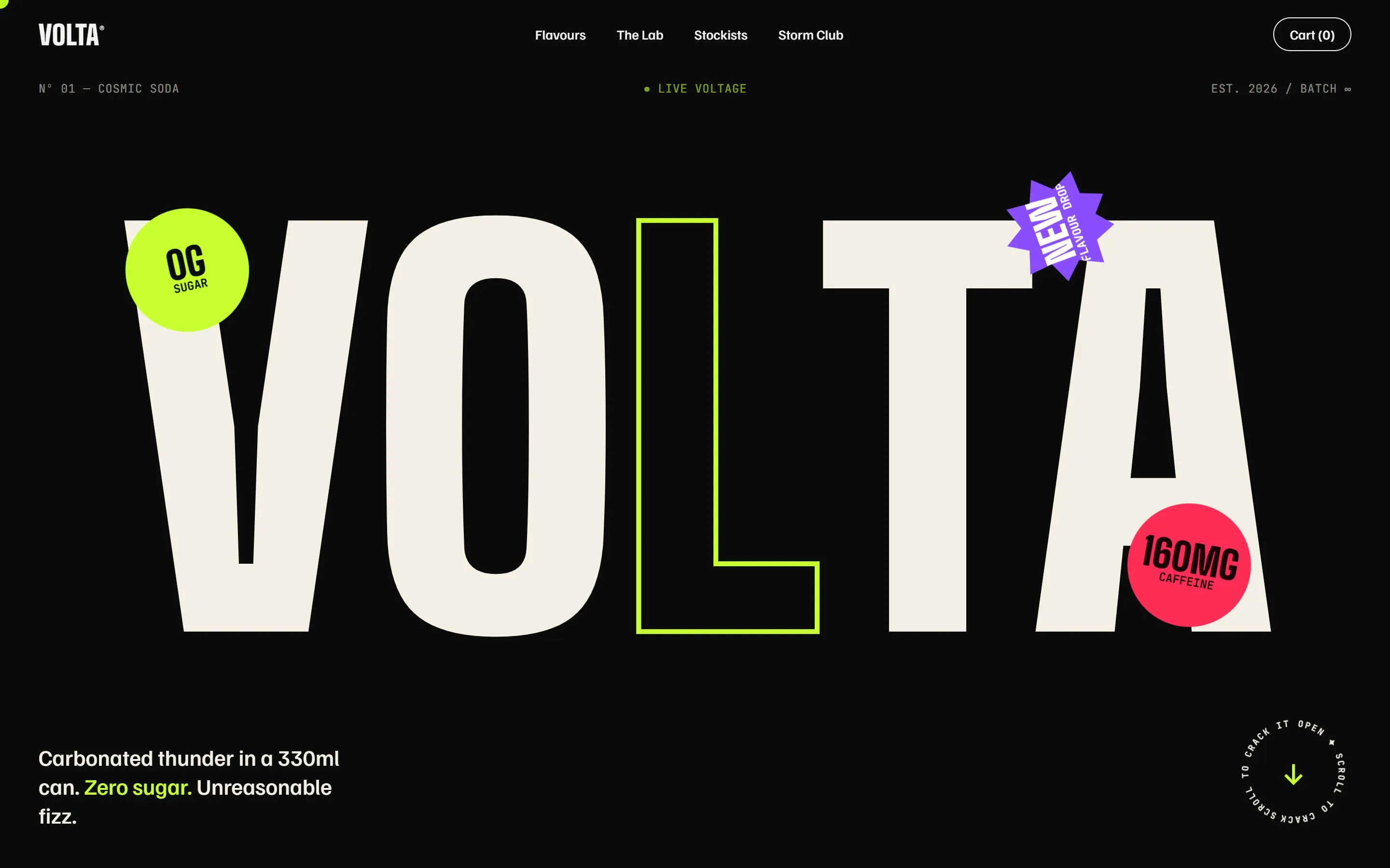
A scroll-animated website for a drinks brand pitch
Volta is a concept we designed and built to pitch a prospective client: a zero-sugar soda with three flavours and a loud personality. Instead of a slide deck, we showed them a working website, so they could scroll through their launch before committing to it.
The site is hand-coded with GSAP scroll animation and smooth scrolling. Giant type, sticker-style badges, flavour panels and an exploded view of the can move as you scroll, and it all still works on a phone. It is the kind of brand and product launch site we build when a business wants to stand out.
See our custom website developmentThe client
Volta is a concept for a prospective client in the drinks business: a zero-sugar soda in three flavours, Lime Lightning, Plasma Cherry and Nebula Grape, with a playful, high-energy brand. The brand and product are fictional; the site was made to win the project.
The brief
A pitch has to make a client feel what their brand could be, quickly. Rather than mock-ups, the goal was a real website they could open on their own phone: loud enough to match the product, clear about the flavours and the offer, and smooth to scroll.
What we built
Type as the hero
The name fills the first screen in huge letters, with sticker-style badges for the key facts: zero sugar, the caffeine content and a new flavour drop.
Flavours told one by one
Each flavour gets its own panel with a name, a short description and tasting notes, revealed in turn as the visitor scrolls.
Motion on scroll
GSAP ScrollTrigger and smooth scrolling drive the reveals, the exploded view of the can and the moving text bands, without a heavy framework behind them.
A clear next step
After the story, the page ends on one offer, a 12-pack with a price and a button, so the pitch shows how the site would sell as well as how it looks.
Built with
- HTML
- CSS
- JavaScript
- GSAP
- Lenis
The result
The prospective client got to scroll through their launch before it existed, which made the conversation about how the brand should feel, not about a static mock-up.
Want something like this? See our custom website development or tell us about your project.
-
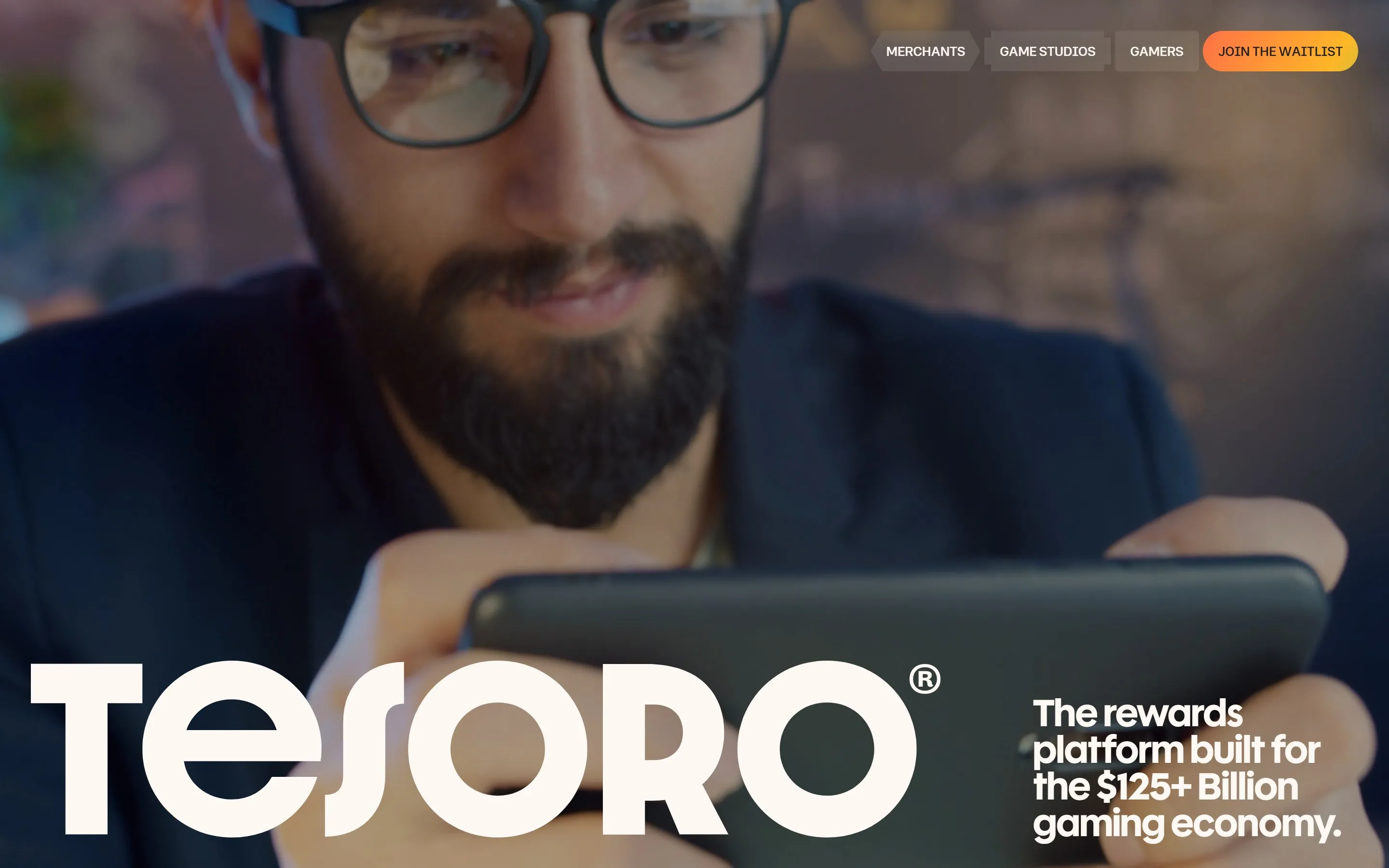
Tesoro
A responsive site for a platform that links brands, merchants and gamers through card-linked offers and in-game rewards.
See the project -
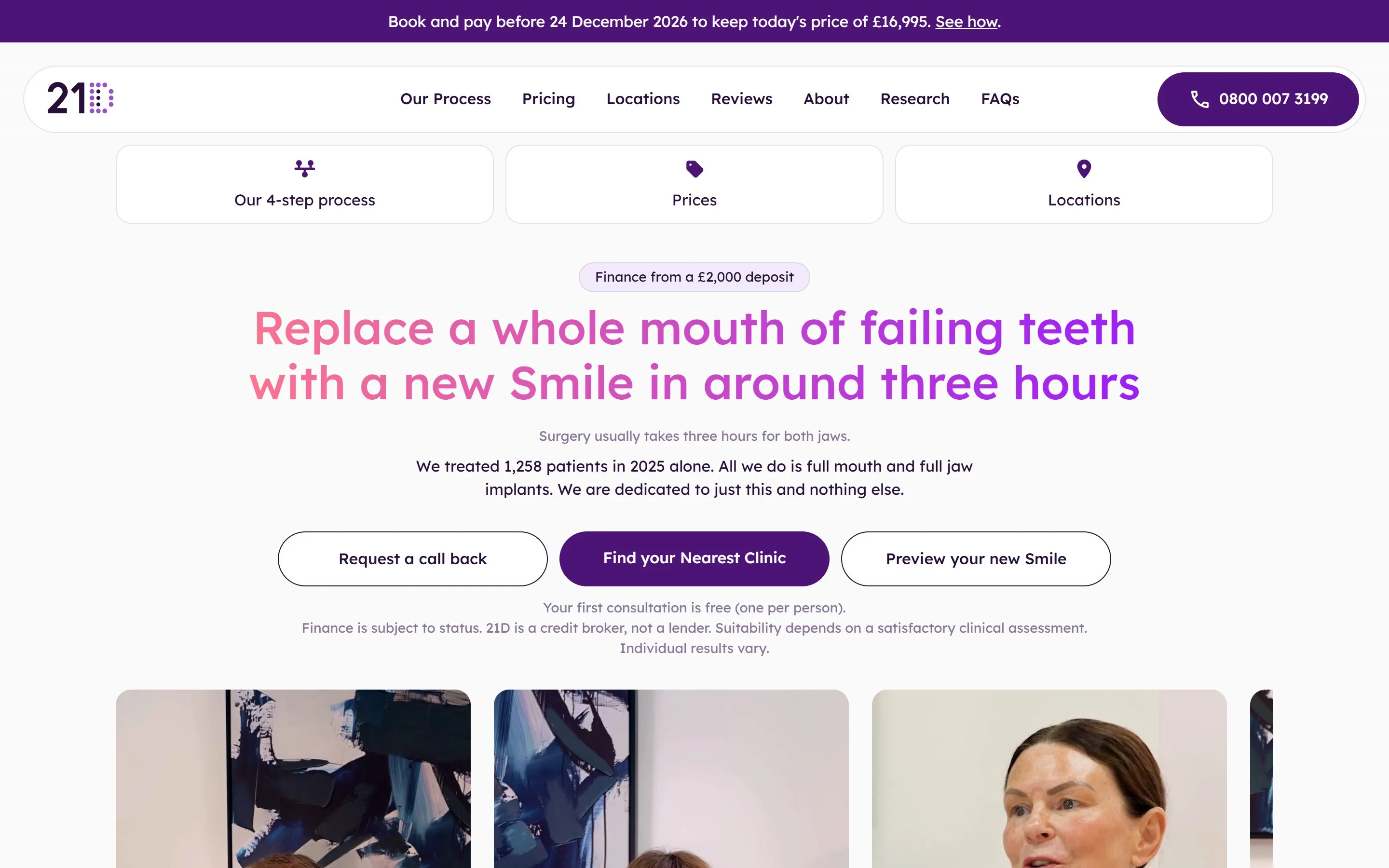
21D
A Webflow site for a UK provider of full mouth dental implants, with clear pricing, finance and a clinic finder.
See the project -
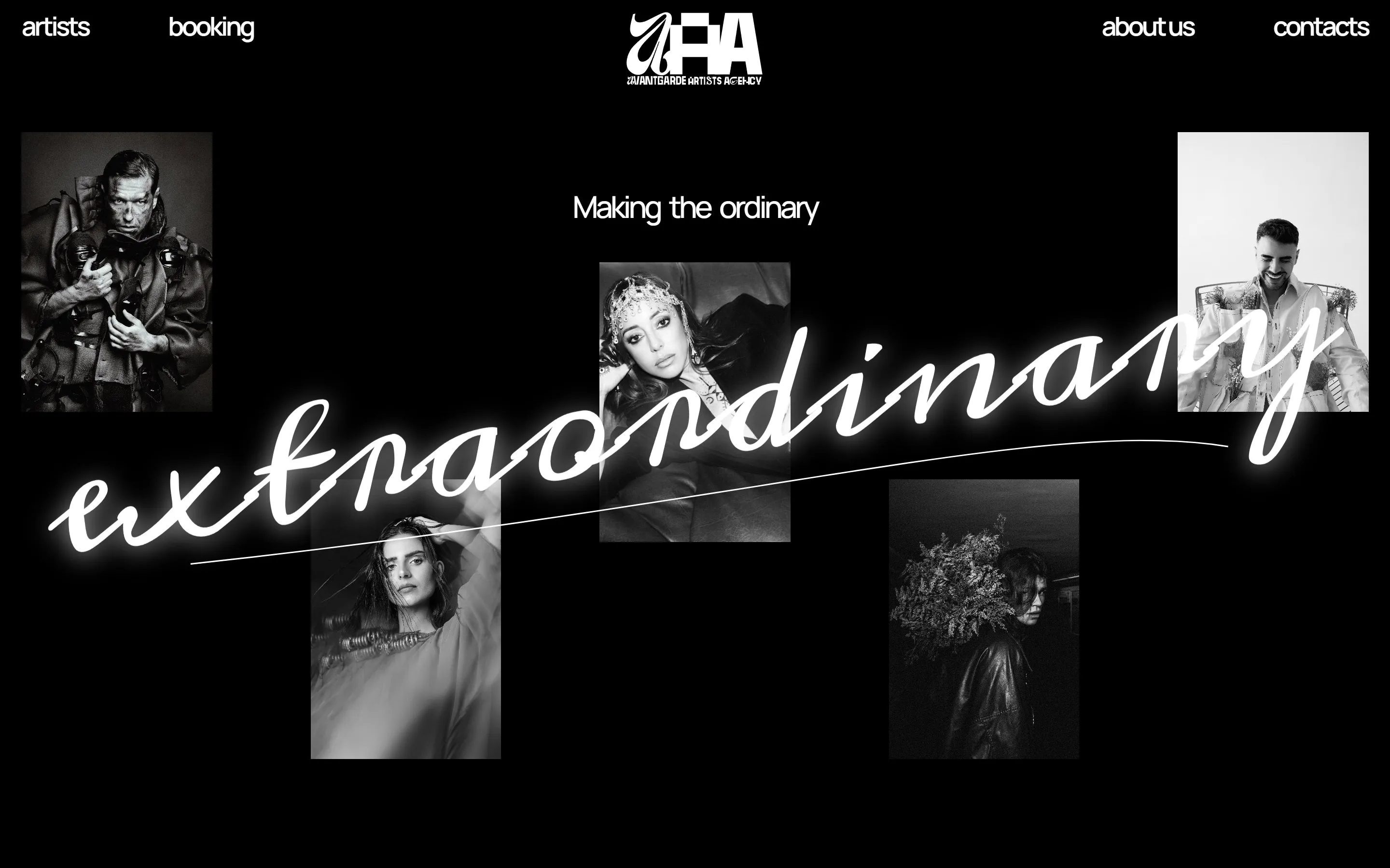
Avantgarde Artists Agency
A booking and artist roster site for an electronic music agency, with bold editorial layouts.
See the project -
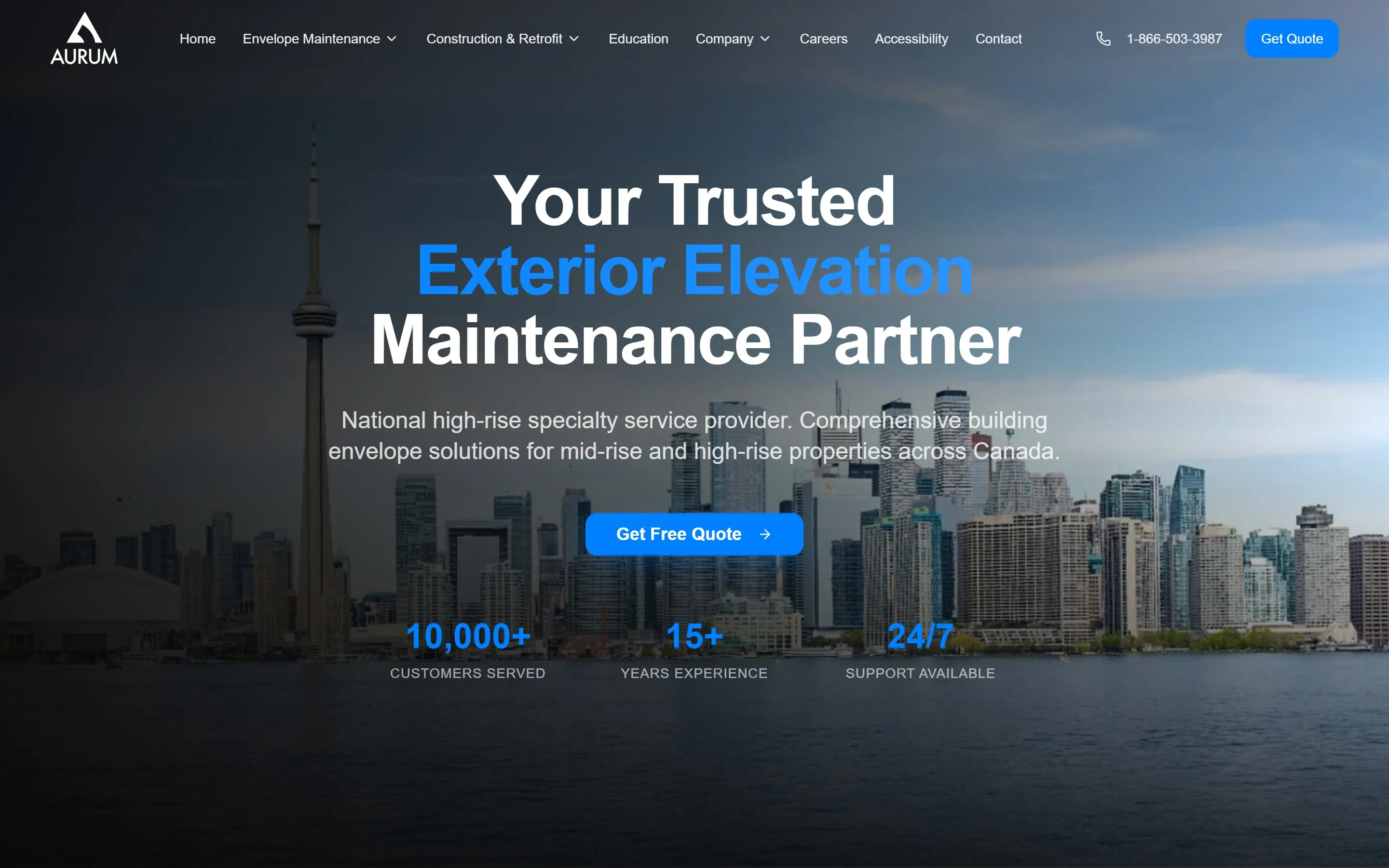
Aurum
A custom-coded site for a Canadian company that cleans, seals and repairs the outside of mid-rise and high-rise buildings.
See the project -
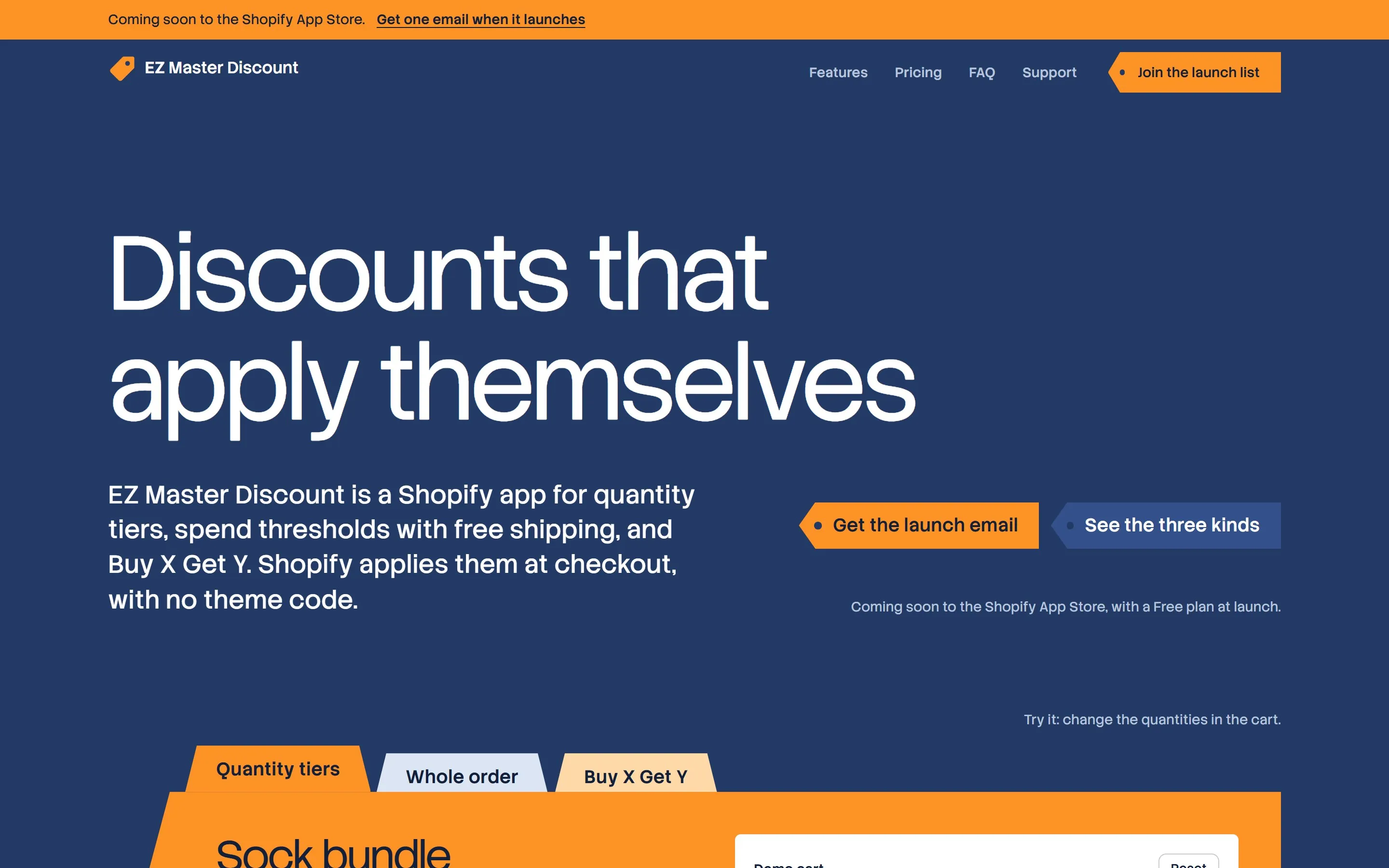
EZ Master Discount
The marketing site for our own Shopify discount app, with a working demo cart that shows each discount apply.
See the project -
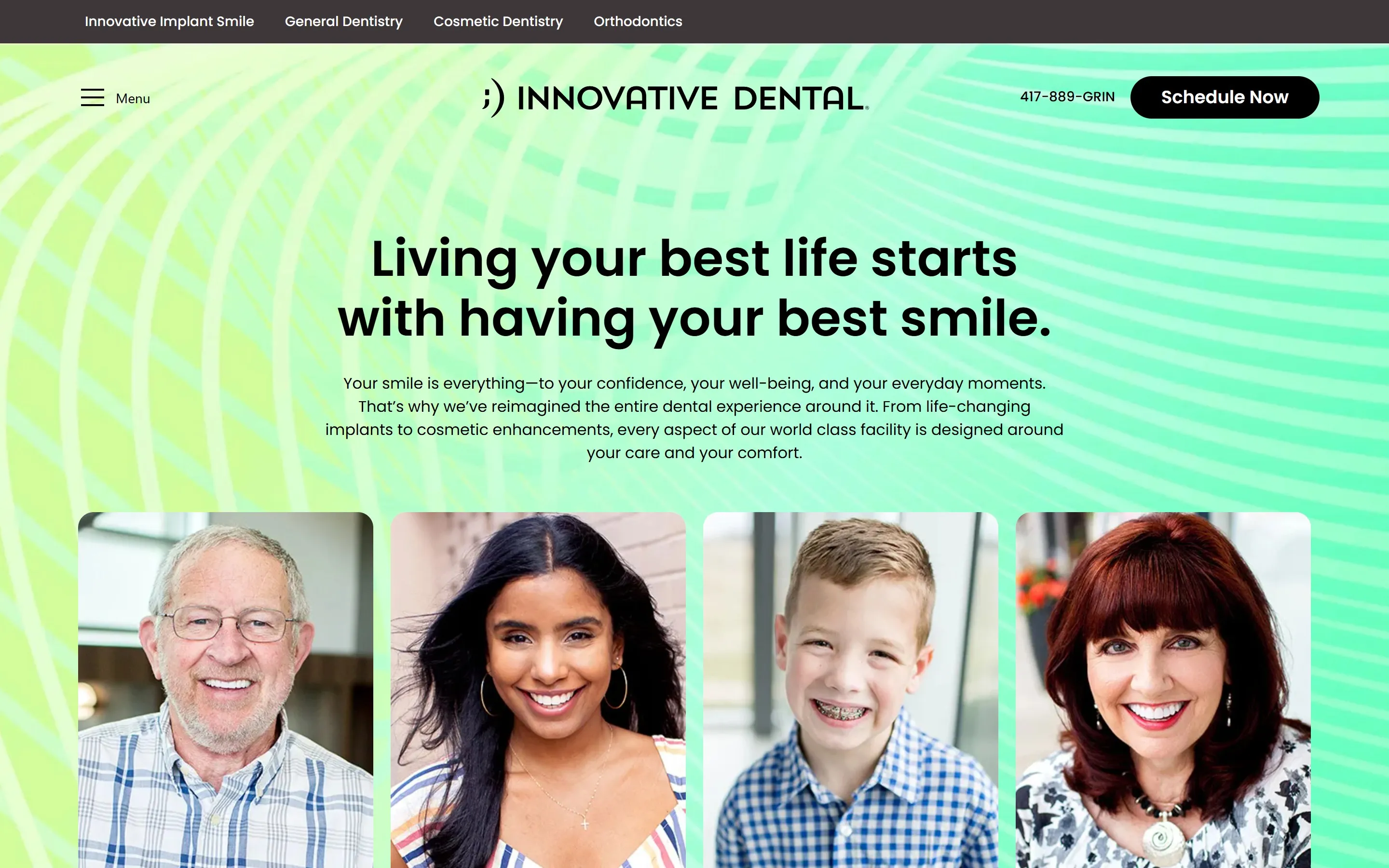
Innovative Dental
A calm, accessible site for a premium dental practice, built to bring in bookings and give patients confidence.
See the project -
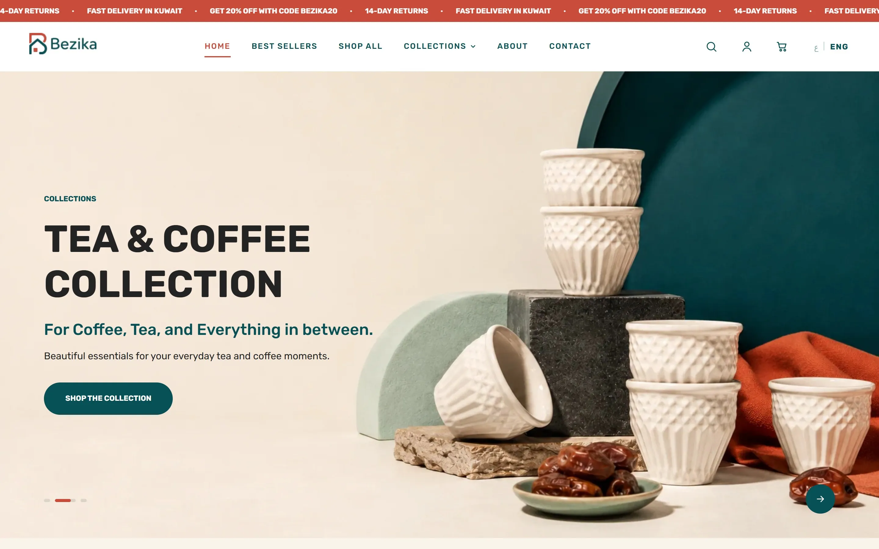
Bezika
An Arabic and English Shopify store with clear product discovery and custom theme work.
See the project -
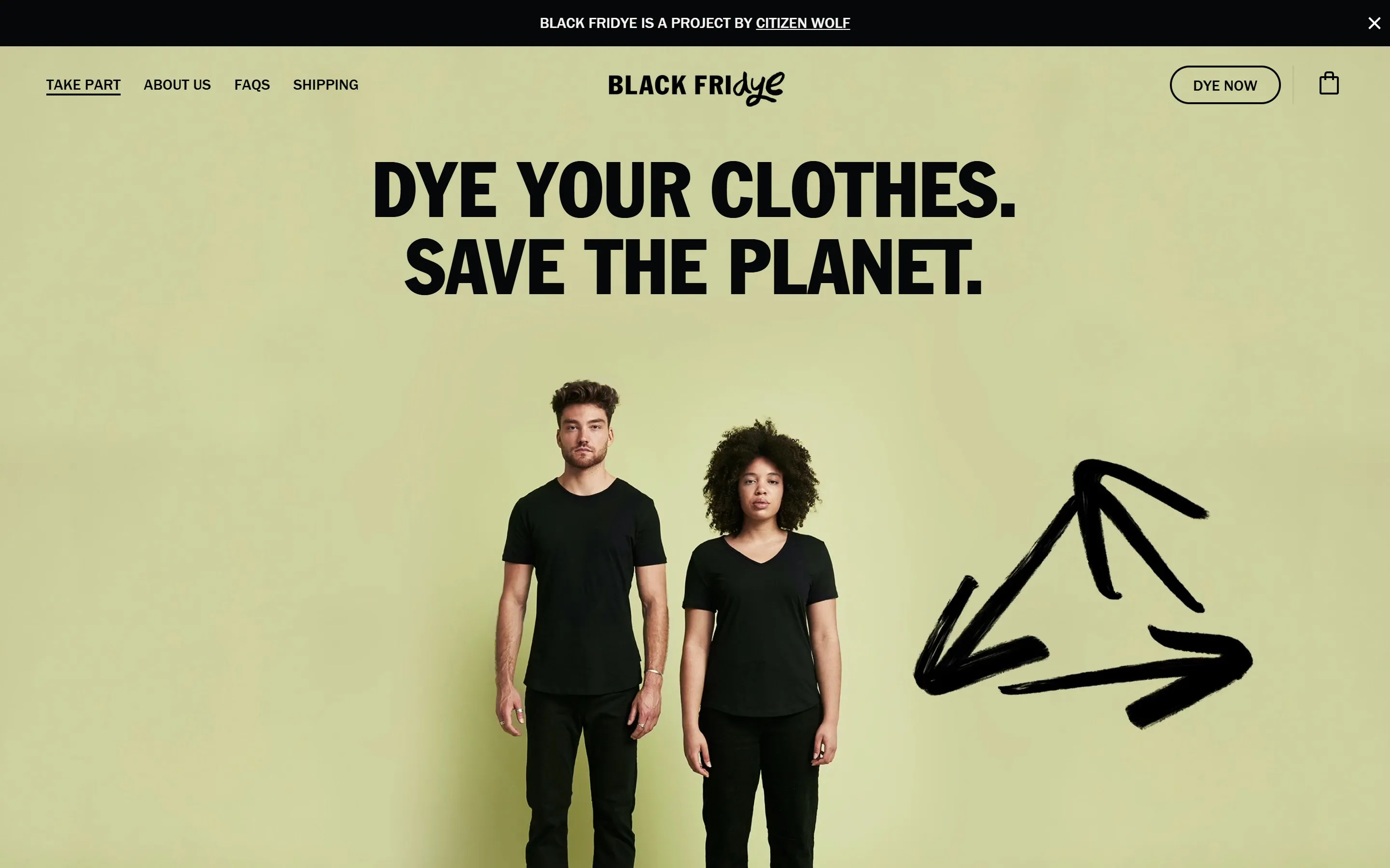
Black Fridye
A Shopify site for a service by Citizen Wolf that dyes worn clothes black to give them a longer life.
See the project -
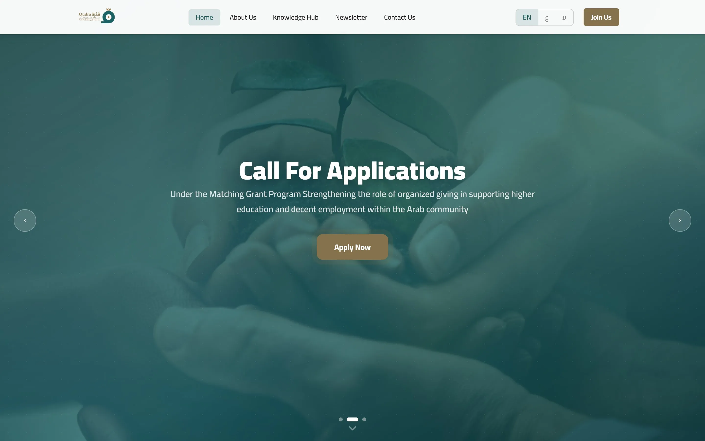
Qudra
A WordPress site in Arabic, English and Hebrew with right-to-left layouts and a custom accessibility plugin.
See the project -
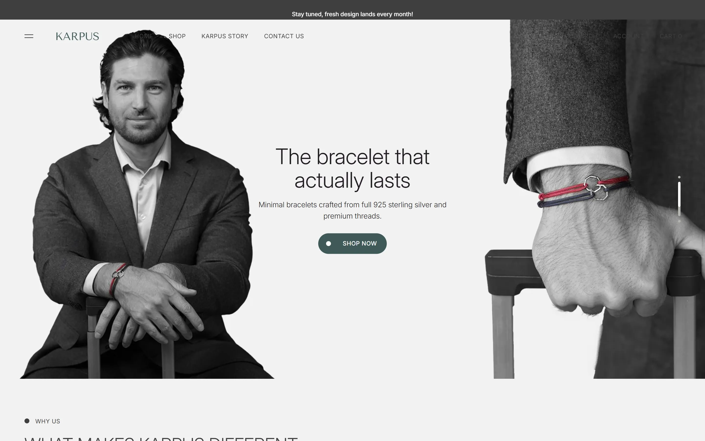
Karpus
A minimal Shopify store with careful product presentation and layouts that work on every screen.
See the project -
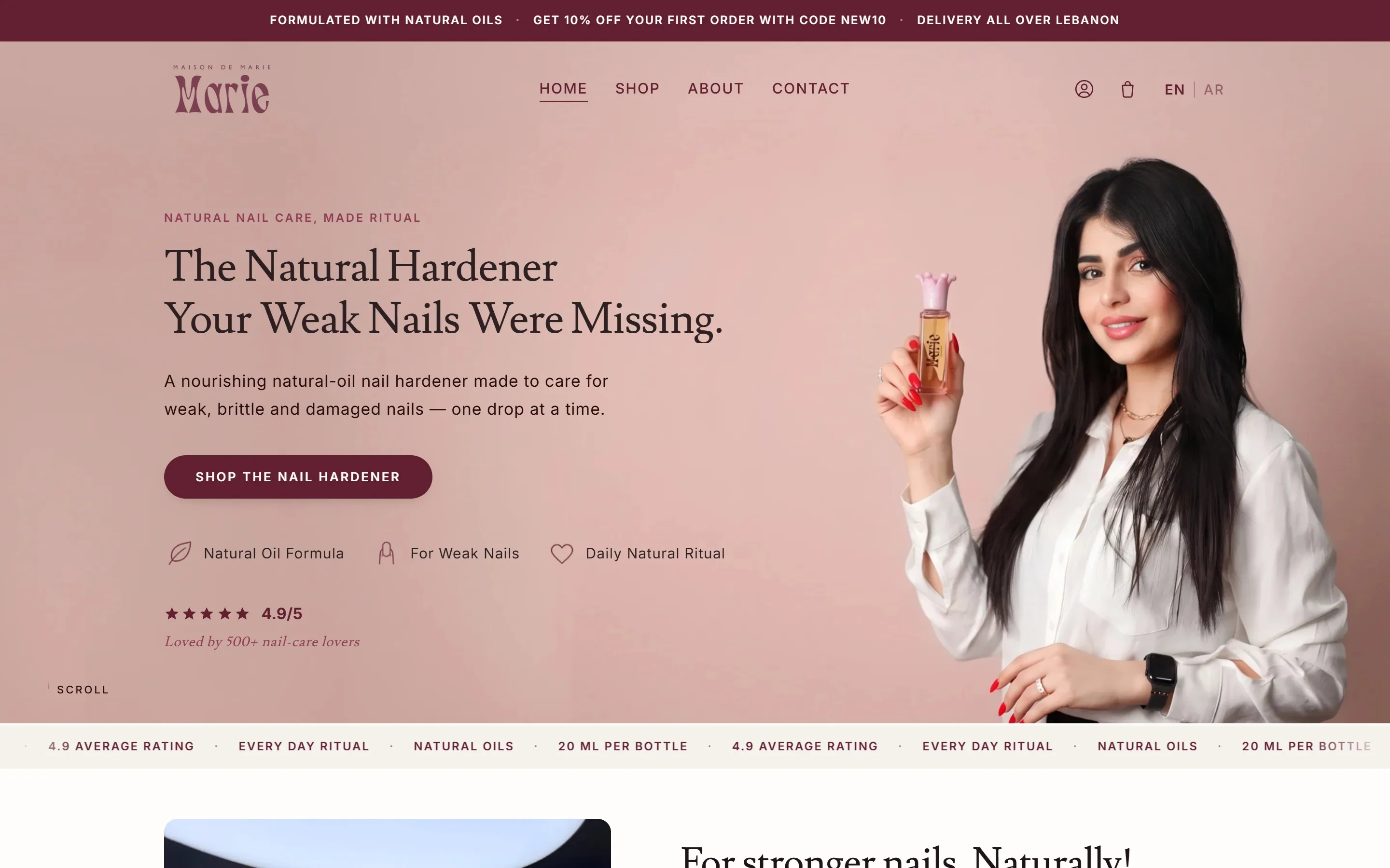
Maison de Marie
A refined Shopify storefront focused on product presentation and a smooth checkout path.
See the project -
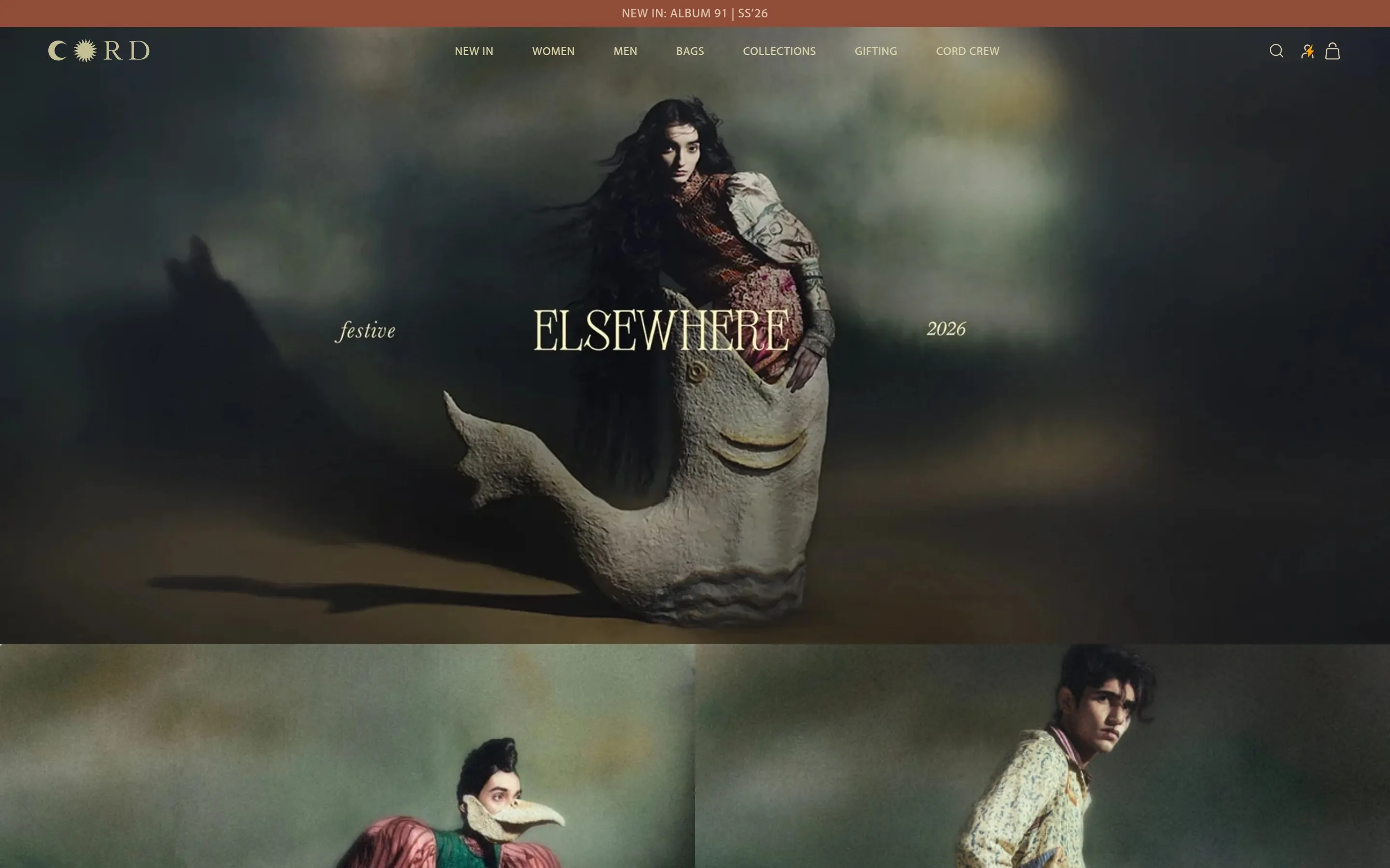
Cord Studio
A Shopify store for contemporary clothing and leather goods, with made-to-order monogramming.
See the project -
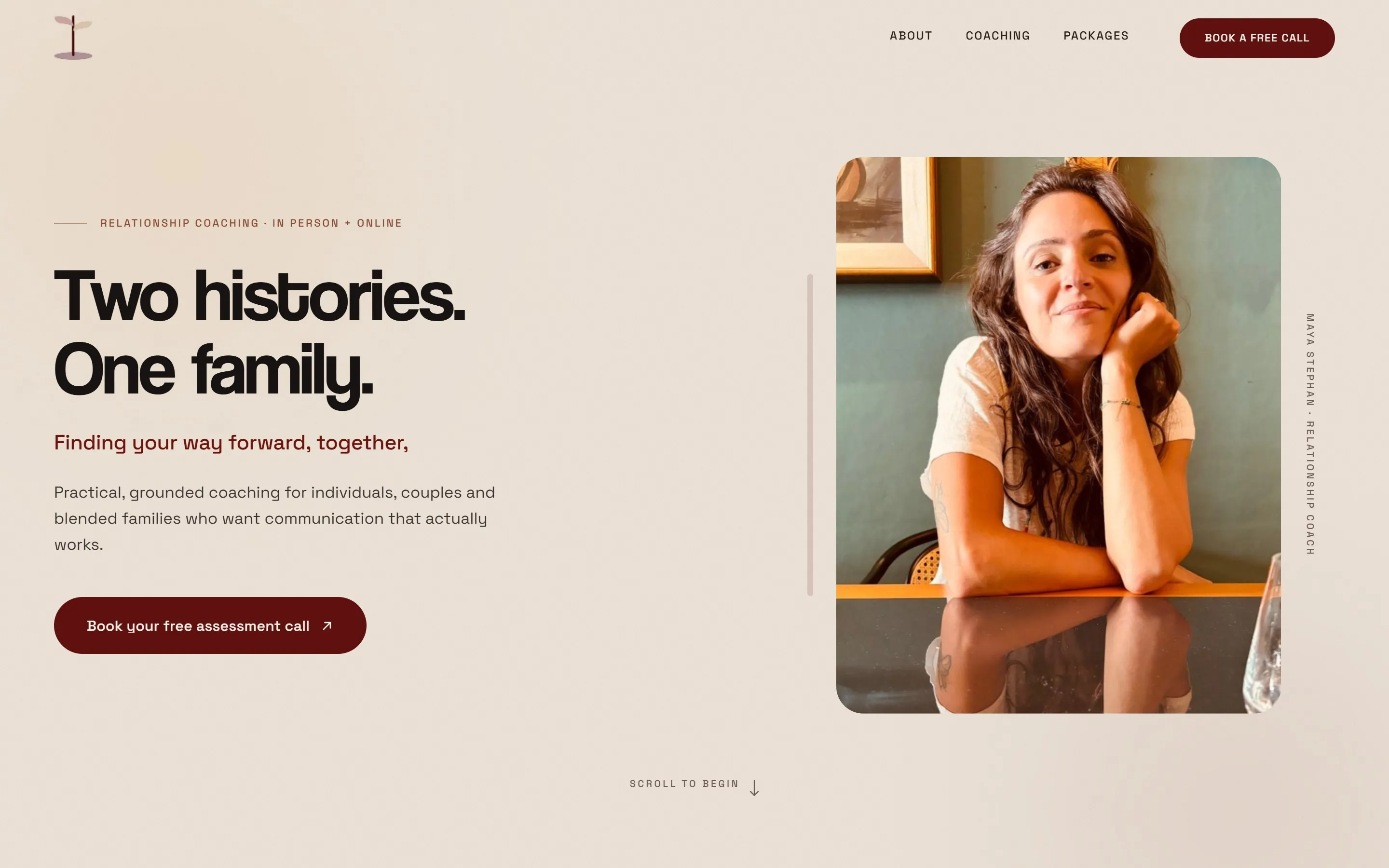
Coaching with Maya
A warm WordPress site presenting coaching services, packages and booking.
See the project